There were three main things I got from this chapter: you need to know how to utilize data correctly and efficiently, know who your audience is and that it is paramount journalists visualize data. Throughout this book I’ve seen so many examples of when data visualizations made real change and impact.
For example, Mapping L.A. by The Los Angeles Times created a way to gather data on specific neighborhoods. From there a wide array of stories and issues could be addressed.
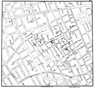
Creating certain types of visualizations per different types of audience can also make or break your story. The Different Charts Tell Different Stories section gives a map of showing where there were cases of cholera in London. In a city that massive, it wouldn’t do any good just to list the cases. By showing exactly where the concentrations of out breaks are authorities could address the issues there and residents would know to avoid the area.
Data is a great tool that is just waiting for journalists to use it. I hope that after reading this handbook and completing the course I can use data and coding to better tell my stories.